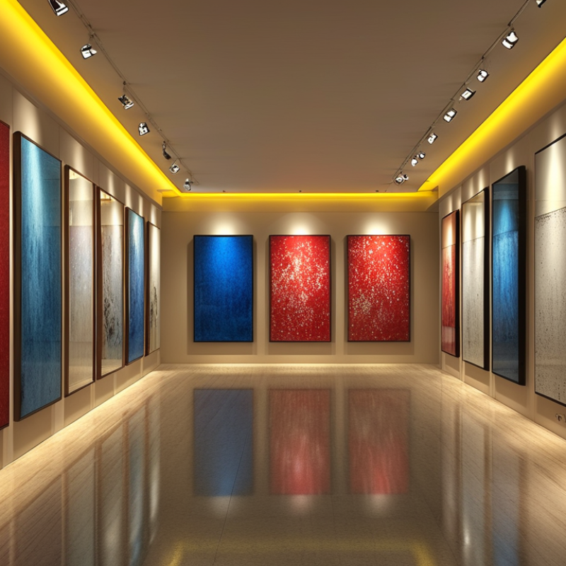
How to Choose the Best Art Lights for Your Gallery?

Time:2026-09-09 Author:Charlotte
0%

Choosing the best Art Lights for a gallery is not simply a matter of making paintings look brighter. Light shapes color, texture, contrast, and the visitor’s emotional response. A deep blue canvas may appear calm under balanced illumination, yet turn dull beneath a warm, yellow beam. The wrong fixture can also create glare on glass, harsh shadows on sculpture, or uneven brightness across a long wall.

Gallery owners should examine several practical details before choosing Art Lights. Color rendering matters because visitors must see accurate reds, skin tones, and subtle neutrals. A high CRI rating is useful, but it should not be treated as the only measure. Beam angle, dimming control, heat output, flicker, and installation flexibility also influence the viewing experience. LED fixtures are often preferred for their efficiency and lower ultraviolet emissions, although product quality varies considerably.

Test the light in the actual room.

A sample installation can reveal problems that product specifications miss. Stand several steps away from the artwork and check reflections, shadows, and visual comfort. Speak with lighting designers, conservators, and experienced gallery installers when valuable or sensitive works are involved. Their advice can prevent expensive adjustments later. Still, no recommendation fits every exhibition. A small mistake in color temperature may change the atmosphere more than expected, so careful testing remains essential. This guide explores how to compare Art Lights and create a controlled, respectful setting for every piece.

How to Choose the Best Art Lights for Your Gallery?

Set Conservation Targets: 50–200 Lux for Light-Sensitive Artworks

Choosing art lights begins with a conservation target, not brightness. For light-sensitive works, aim for 50–200 lux at the artwork surface. Watercolours, dyes, photographs, manuscripts, and some textiles can fade under excessive exposure. A lux meter gives a more reliable reading than judging brightness by eye. Place it where the artwork hangs, then measure several points across the frame. Corners may receive less light.

In a gallery, I would begin near 50 lux for fragile pigments and increase only when viewing needs justify it. More durable materials may tolerate the upper part of the range, but confirm that choice with a qualified conservator. However, lux alone does not describe total risk. Exposure time matters. Eight hours daily creates a different annual dose than occasional viewing. Record lux, opening hours, and lamp position in a simple conservation log.

Choose fixtures with controlled beams, low ultraviolet output, and minimal heat near the surface. Test reflections on glass and watch for bright patches on dark paint. I once approved an even-looking setup that made visitors miss subtle brushwork. It met the meter reading, but not the viewing goal. That mistake changed my process: review measurements with a conservator, inspect the work at visitor height, and reassess after installation. A target is useful, yet it is not a permanent answer.

Prioritize Color Accuracy: CRI 90+ and Strong R9 for Faithful Rendering

Choosing gallery lighting begins with color accuracy, not brightness alone. In my experience, a powerful fixture can make a red textile look brown. That mistake changes the artwork’s meaning. Aim for a color rendering index (CRI) of 90 or higher. More importantly, inspect the R9 value, which measures saturated red reproduction. Strong R9 helps preserve vermilion paint, warm skin tones, coral, and burgundy fabric.

Gallery professionals should compare test samples under the proposed lights. Place a red ceramic tile, blue paper, and neutral gray card beside the artwork. Check them at viewing distance, not only beneath the fixture. A high CRI does not guarantee excellent performance across every color. R9 may be strong while deep blue or violet remains weak. That detail is easy to miss. Use a spectrometer when possible, and record readings before installation. I once trusted a specification sheet too quickly; the finished room looked cooler than expected.

Tips: Request a documented R9 value, rather than an implied claim. Check CRI and R9 at the fixture’s actual brightness. Compare daylight, gallery lighting, and photographs. Control glare with precise aiming and suitable beam angles. Recheck after wall colors and frame glass are installed. Small reflections can shift perceived color. Test carefully.

How to read this chart: For gallery lighting, choose fixtures with a CRI of at least 90 and a strong R9 score of 80 or higher. CRI indicates overall color fidelity, while R9 focuses on saturated red tones that are important for accurately rendering skin, paintings, textiles, and warm pigments.

Match Color Temperature: Compare 2700–3000K and 3500–4000K Settings

How to Choose the Best Art Lights for Your Gallery?

Color temperature changes how visitors read an artwork. Settings between 2700K and 3000K create a warm, amber atmosphere. They can flatter portraits, wooden frames, and earth-toned paintings. However, excessive warmth may dull blue, green, and cool gray details. I have over-warmed a test wall before. The reds looked inviting, but the painting lost tension.

Settings from 3500K to 4000K appear cleaner and more neutral. They suit contemporary art, photography, white walls, and blue-heavy compositions. Kelvin alone is not enough. The IES TM-30-18 method evaluates light across 99 color samples, using fidelity and gamut metrics. Ask for TM-30 results, not only a high CRI claim. The CIE 157:2004 report also recommends careful exposure control: 50 lux for highly light-sensitive objects, 200 lux for moderately sensitive materials, and 300 lux for less sensitive works.

Tips: Test both ranges on the actual artwork. View the piece at opening time and after sunset. Place a small 2700K lamp beside a 4000K lamp. Check skin tones, deep blues, varnish glare, and paper texture. Keep the beam narrow enough to reduce spill, but not so narrow that edges become visually harsh. A neutral setting may seem safer, yet it can feel clinical. Warm light may feel elegant, yet it can distort intent. The right choice often needs revision.

Select Beam Angles from 15°–40° for Focused, Even Artwork Illumination

Choosing the right art light begins with beam control, not maximum brightness. For most gallery walls, 15°–40° beams create focused, even illumination without flooding nearby surfaces. A 15° beam suits small paintings or distant fixtures. A 24°–30° beam often works better for medium-sized canvases. Larger works may need 36°–40° coverage. Measure the canvas.

CIE 157:2004 recommends approximately 50 lux for highly light-sensitive materials, 200 lux for moderately sensitive works, and 300 lux for less sensitive materials. These limits protect pigments, paper, and textiles from cumulative exposure. Beam angle does not set lux by itself. Fixture distance, lumen output, mounting height, and aiming accuracy also matter. Avoid guesswork. Use a calibrated lux meter at the artwork surface.

Color quality deserves equal attention. The Illuminating Engineering Society’s TM-30-20 method evaluates fidelity and gamut with more detail than a single CRI value. Aim for stable spectral performance, especially when displaying skin tones, reds, and subtle blue-gray shades. A narrow beam can produce dramatic contrast, but it may reveal glare on varnish or glass. I have found that a slightly wider beam often looks more natural after installation. Test at viewing height, then adjust the angle by a few degrees. CIE 157:2004 and IES TM-30-20 provide useful benchmarks, but the artwork, room geometry, and visitor position still require professional judgment.

Verify LED Efficiency: 50,000-Hour Life, Low Flicker, and Dimming Control

Choosing art lights begins with protecting the artwork, not simply increasing brightness. A 50,000-hour LED rating can reduce relamping in high-ceiling galleries. The U.S. Department of Energy reports that quality LEDs commonly reach 25,000 to 50,000 hours. However, that figure often describes useful life under controlled conditions. Heat, dust, and continuous operation can shorten performance.

Flicker deserves closer attention. The IEEE 1789-2015 recommended practice links visible flicker risks to modulation depth and frequency. CIE Technical Note 006:2016 also warns that percentage flicker alone cannot describe every lighting effect. Ask suppliers for flicker data across the entire dimming range. Flicker matters. A camera may reveal banding that visitors cannot see, yet artwork documentation can still appear unusable. Test with a phone camera and a professional flicker meter when possible.

Dimming control should feel gradual beside delicate paintings. Look for stable output from 100% down to the gallery’s working level, without buzzing, color shifts, or sudden dropouts. A 2023 U.S. Department of Energy solid-state lighting report emphasizes that controls and compatibility strongly influence real-world savings. I would not accept “dimmable” as sufficient evidence. Install a sample above a framed work, then observe it during opening hours and after several hours of operation. The first test may pass, but the second often exposes heat and control problems.

How to Choose the Best Art Lights for Your Gallery? - Verify LED Efficiency: 50,000-Hour Life, Low Flicker, and Dimming Control

Evaluation Dimension Recommended Gallery Specification Why It Matters for Artwork Verification Method
Rated LED Life At least 50,000 hours at L70, with a published temperature rating L70 indicates the point at which average light output is expected to reach approximately 70% of the initial level. Longer life reduces relamping and color-shift risk. Check the LM-80 and TM-21 documentation, rated ambient temperature, and whether the rating applies to the complete luminaire.
Energy Efficiency Prefer approximately 80–120 lumens per watt for the complete fixture Higher lumens per watt can reduce electricity use while maintaining the required illuminance on the artwork. Use tested luminaire output and input power, not LED-chip efficiency alone. Confirm photometric reports where available.
Flicker Performance Choose a low-flicker driver; target low modulation depth and compliant PstLM/SVM results Reduced temporal light modulation improves visual comfort and helps avoid visible banding in photographs and video recordings. Request flicker data measured at full output and throughout the dimming range. Check PstLM and SVM values where applicable.
Dimming Range Smooth, stable dimming from approximately 10% to 100%; lower levels are beneficial when verified Allows curators to adjust emphasis, accommodate sensitive materials, and create consistent viewing conditions. Test for dead travel, sudden jumps, audible noise, color change, and flicker at 25%, 50%, 75%, and 100% output.
Control Compatibility Use a control protocol suited to the installation, such as 0–10 V, DALI-2, or compatible phase-cut control Compatible controls support zoning, repeatable scenes, daylight management, and future system expansion. Confirm driver, dimmer, wiring, minimum load, and control-system compatibility before installation.
Color Rendering CRI 90 or higher; review the R9 value for strong red reproduction High color rendering helps preserve the perceived relationships among pigments, materials, skin tones, and finishes. Review independent color data, including CRI, R9, TM-30 values, and color consistency between fixtures.
Correlated Color Temperature Typically 2700–3500 K for a warm, gallery-oriented atmosphere; select by collection and wall finish CCT changes the apparent warmth of the space and can influence how visitors perceive color and texture. View samples beside representative artwork and verify consistency across the complete installation.
UV and IR Output Use LED fixtures with negligible UV and low infrared radiation compared with traditional sources Lower ultraviolet exposure and reduced radiant heat can help limit photochemical fading and heat-related stress, although total light dose remains important. Request spectral data and manage illuminance, exposure time, distance, and beam concentration according to conservation guidance.
Beam Angle and Glare Select narrow, medium, or wide optics according to artwork size; use shielding or honeycomb accessories where needed Correct distribution improves uniformity and contrast while reducing reflections on varnish, glass, and glossy surfaces. Check beam spread, aiming flexibility, cut-off angle, glare rating, and reflections from visitor viewpoints.
Maintenance and Thermal Design Use passively cooled or well-ventilated fixtures with replaceable or serviceable drivers where practical Good thermal management supports stable output, color consistency, and the stated LED lifetime. Review operating temperature, driver access, cleaning requirements, photometric maintenance, and spare-part availability.
Selection note: Treat 50,000 hours as a design-life claim rather than a guarantee of unchanged output. For conservation-sensitive displays, evaluate illuminance, exposure duration, spectrum, flicker, and dimming behavior together.

FAQS

: Why is color accuracy important in gallery lighting?

: Brightness alone can distort artwork. A red textile may appear brown, changing its visual meaning.

What CRI and R9 values should gallery lights provide?

Choose CRI 90 or higher. Request a documented R9 value for saturated reds, coral, skin tones, and burgundy.

Can high CRI guarantee accurate artwork colors?

No. High CRI may still reproduce deep blue or violet poorly. Test actual artwork samples under the proposed lights.

How can color performance be tested before installation?

Place a red ceramic tile, blue paper, and gray card beside the artwork. Check them from viewing distance.

Which beam angles suit different artwork sizes?

A 15° beam suits small paintings or distant fixtures. Medium canvases often need 24°–30°. Larger works may need 36°–40°.

How should gallery staff control artwork brightness?

Measure lux at the artwork surface with a calibrated meter. Material sensitivity, fixture distance, and mounting height all matter.

What should be checked when using narrow beams?

Narrow beams create strong focus but may reveal glare on glass or varnish. A slightly wider beam can look more natural.

Does a 50,000-hour LED life rating guarantee long service?

No. Heat, dust, and continuous operation can shorten performance. Inspect fixtures after several operating hours.

How can flicker and dimming problems be identified?

Request flicker data across the full dimming range. Test with a phone camera and, when possible, a professional meter.

What makes dimming suitable for delicate artwork?

Output should change smoothly without buzzing, color shifts, or sudden dropouts. “Dimmable” alone is not enough evidence.

Conclusion

Choosing the best Art Lights for a gallery begins with protecting the artwork while presenting it in its most accurate and appealing form. Establish conservation targets first, keeping illumination between 50 and 200 lux for light-sensitive pieces. Next, prioritize color quality by selecting lighting with a CRI of 90 or higher and strong R9 performance, which helps preserve the richness of reds and other difficult-to-render tones. Color temperature should also match the artwork and gallery atmosphere: warmer settings around 2700–3000K can create an intimate mood, while 3500–4000K provides a cleaner, more neutral appearance.

Beam angle is another important consideration. Options between 15° and 40° can provide focused yet even coverage, depending on the artwork’s size and placement. Finally, evaluate LED efficiency and control features, including a service life of approximately 50,000 hours, low flicker, and smooth dimming. A well-balanced lighting plan can enhance visual impact, reduce energy use, and support long-term artwork preservation.

Charlotte

Charlotte

Charlotte is a seasoned marketing professional with a deep understanding of the company's portfolio and a passion for elevating its presence in the market. With a keen eye for detail and a commitment to excellence, she ensures that our professional blog is regularly updated with insightful articles......